San Francisco Symphony
- Animation
- Branding
- Design
- Strategy
- Style Guides
- Toolkitting
BRIEF: HELP A SYMPHONY PERFORM IN MOTION
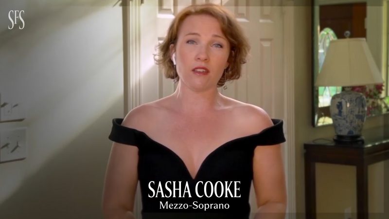
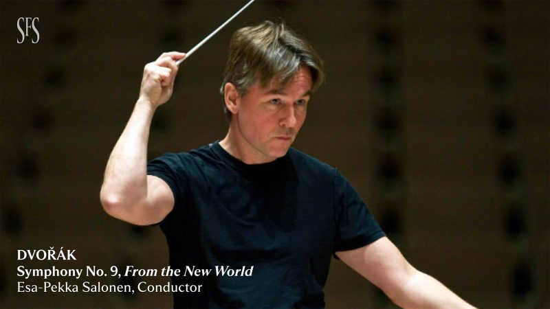
The San Francisco Symphony came to And/Or to help them translate their active, bold, and gorgeous new visual identity, based upon the idea of “seeing sound,” in motion. It was smack in the middle of COVID and SFS needed packaging for virtual performances, as well as a motion toolkit they could apply to future online series and performances.


PRELUDE: CURRENTS SHOW PACKAGING
We dove into work by first creating a show package for Currents, a series of four videos featuring a mix of bespoke performances and conversation covering Chinese, Jazz, Hip-Hop, and Latin themes. This initial work allowed us to begin playing with the variable fonts of the brand identity and figuring out movement and animation behavior that set us up to explore the larger brand toolkit.


SOLUTION: ELEVATED ELEMENTS THAT PLAY TOGETHER PERFECTLY
We developed the SFS motion system around three core concepts unique to SFS: visualizing sound, timeless minimalism, and unexpected kinetics. These principles drove the components of our toolkit like dynamic color palettes, piece names, lower thirds, promos, end cards, CTAs, mortises and transitions. We also developed logo animations for SFS and their premium content SFS+. When work was complete, the SFS team was armed with multiple options for every element, screen size, and platform, ensuring a consistent performance across every platform.