truTV Rebrand
- Animation
- Art Direction
- Branding
- Design
- Strategy
- Style Guides
- Toolkitting
BRIEF: DRESS FOR THE PREMIUM COMEDY NETWORK YOU WANT TO BE
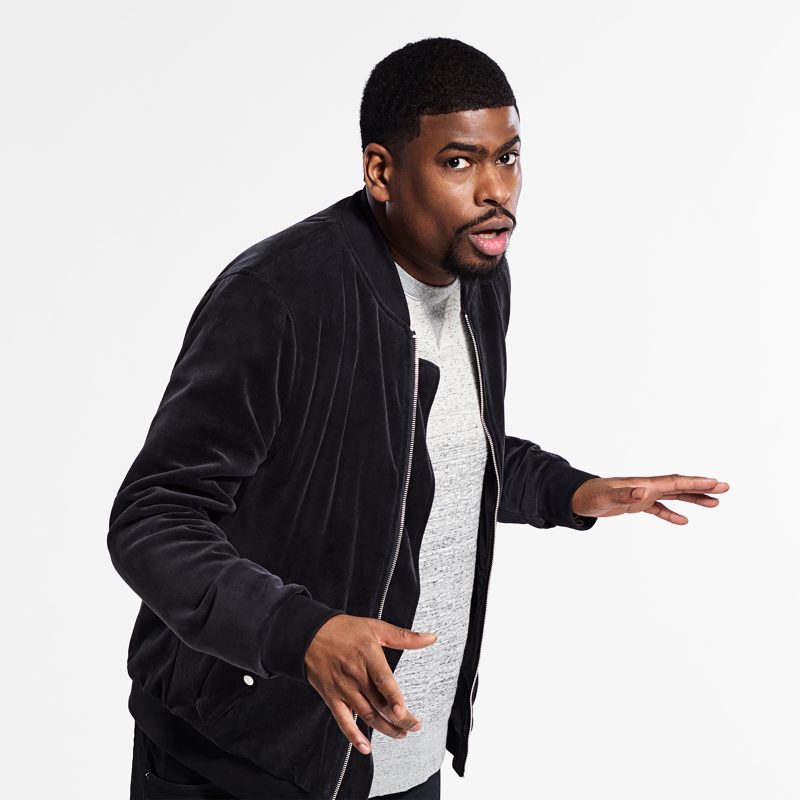
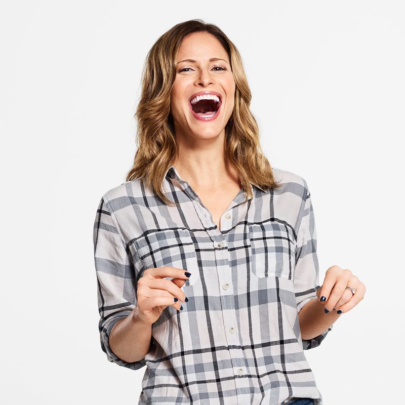
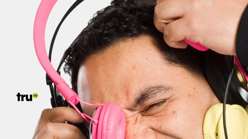
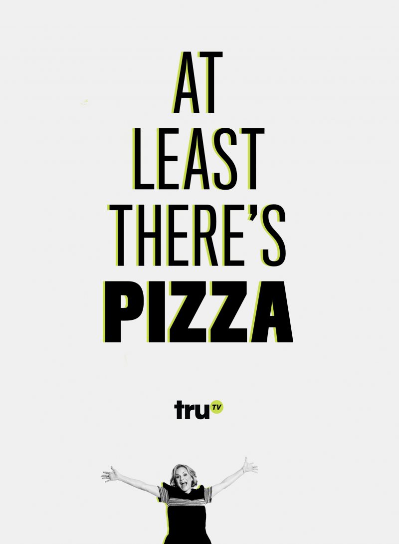
truTV had outgrown its past life as a reality network, evolving to become a comedy upstart drawing big names and lots of buzz. Armed with a new tagline, “Funny cause it’s tru,” the network asked us to rethink their look with a 360 rebrand that would announce their ambitions while keeping their talent and shows front and center.
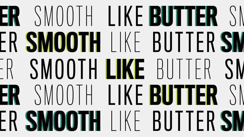
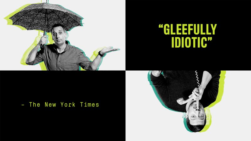
SOLUTION: A STREAMLINED SYSTEM WITH COMEDIC PANACHE
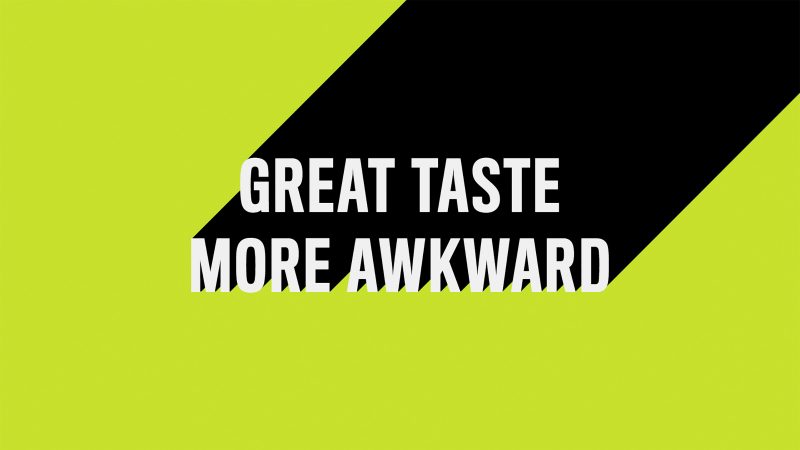
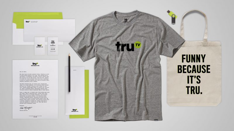
We created a bold, flexible, and confident new on-air brand system that keeps talent front and center, lets key art shine, and supports telling funny truths across every platform. We stripped down the brand to one color and two typefaces and built the brand elements to be adaptable for present and future key art. The playful, edit-friendly animation behavior and modular promo structure gives the tru team a bag of tricks to pull from without feeling boxed in by too many rules and restrictions.
BUT WAIT, THERE’S MORE!
A year after the rebrand went live truTV asked us to audit how everything had been working. That audit led to a rebrand 1.5 project where we developed new tools and guidelines to address some of the needs that had arisen in that year. This included a booster pack for the truTV masterbrand including expanded typefaces and color palette, a unified look and approach to talent brand photography and the development of ‘a tru original’ ID system for on-air and print applications.